Wednesday, 21 April 2010

In what ways does your media product use, develop or challenge forms and conventions of real media products?

My media product looks and performs like a real professional HTML website. The website that I have designed and created is nothing amazing but functions well and is easy to use.

Layout

The layout that we have used is basic but looks professional. We have followed the conventions of a charity website by having a donation button in the top right hand corner of our website. A donate button is conventional for a charity website product. We looked at a variety of other websites and all of them have a donate button. Having this will enhance the likeliness of a person viewing the website and maybe donating to the charity. On are website we have the navigation bar placed horizontally across the page. This is another one of the conventions followed by the major real life websites. It also provides more room on the website for other information and pictures. The navigation bar being horizontal fits in with the background as well and creates potential for the buildings to become hyper links, which will make the website more attractive.


Conventions

The background that we have used on are website is completely are own idea. We started by drawing the outline of the buildings in the background and the clouds in the foreground. The buildings that we have used were the same width but different heights to enhance the look of the picture. After the drawing was finished, we then scanned it into are computer. Once it was scanned into are computer we then opened it in photo shop to create a better and sharper quality to the picture. We also played around with the colours of the building, clouds and the sky to get the right matches of colours that went well together. The background makes are website original and unique. It challenges the current conventions in most websites the background has potential due to the buildings could be used for links to other pages.


The pictures we have used also challenge the conventions of a typical website due to us taking the pictures our selves. The pictures are related to our charity because making are pictures unique and original due to them not being copied off of another website. They are a primary source. The comparison website to our charity community in need to the charity comic relief, we have found out that our website is very similar to the comic relief website for a variety of reasons.


- The colours that we have used are very similar to the page on comic relief. The colours used are neutral but at the same time grab the reader’s attention for important information.
- Are background used on our website is very similar to the comic relief website background. The idea of clouds on the donate page has lead to the further development of using buildings as well. The buildings add to the relevance of our charity due to it being based on a community and it trades in the area.
- Our picture layout is very similar to the comic relief page for we used the main picture in the middle of their page and smaller pictures under the main image to highlight what is on the other pages of the website. We have used this amount of images to interest the reader but not too many that we wouldn’t over crowd the page. It also keeps the page layout neat and tidy.
- The audience that are website is trying to attract is anyone who feels that their area needs help to improve local amenities and to tidy up the local area. We would also like the people who visit our website to get involved in are clean up schemes. Are charity is versatile and is aimed to attract many different groups of people.
- The page names are very similar to the ones used on the comic relief website. This means that we follow the same conventions as them and use similar ways of putting across information. This could also mean that we are trying to target the same target audience as them.
- The text that we have used is very similar to the comic relief website. We have followed the same conventions as them, as the font type is very similar and is easy to read making the website tidy.

How does your media product represent particular social groups?

Community in need is a website designed to attract various readers’ attention to the schemes that are being carried out to improve local communities. The aim of the charity is to make areas more sociable, safer and pleasant to be in. The audience that are website is aimed at is people who feel that their area needs improving in some sort of way, like cleaning up graffiti and litter and reducing the crime in the area, making it a better to place to be.

Colour

On our website we have used a variety of different colours that create a calm feeling which enables easy use of the website. The colours used also make the website stand out from others and create a modern effect. Our background includes a variety of different colours. The colours used are blue, red, black, shades of grey and white. The buildings are coloured in red, black and different shades of grey which make them lively and stand out from background. The use of three repetitive colo urs for the buildings creates a dramatic, vivid affect. The writing consists of two different colours, white and grey. We have chosen these colours due to them standing out from the background grabbing the reader’s attention.


Style of Language

The type of language used on our website is very sincere and appealing to the reader. We have chosen to use this approach of language because it begins to make the reader think about what they can do to improve local communities. The language draws the reader into different articles and could lead to them donating to the charity.


Content and style of the video

The video that we have chosen to use on are website contains a short clip of a person who comes into contact with rundown areas that need improving. Within the short clip a couple of questions are asked, which helps us gain an understanding of the local area. We have chosen to have a short clip because it interests the reader but doesn’t go on for too long making them bored.

Layout and positioning of the page

Community in need is a simplistic charity and is reflected in the layout of our website. The layout of our website is very similar to Comic relief, which could reflect in the target audience we are trying to target.
The background of our website is the main feature. We have chosen this to be the centre of attention because buildings relate to most people. The background we have used is in comparison with the comic relief website, this may be because we are aiming at the same target audience as them. The design incorporates objects and features that people come into contact with in a daily biases.
We have placed information about each picture as the side of them, which enables readers to know what the picture relates to. This makes are website well organised and not too complicated to use.
The photographs within are website are placed in the centre of are page, due to them being the main focus pint. We have included a variety of images on the website to draw the reader’s attention to important messages on our website. The pictures also explain most of the point and therefore less writing is needed. We usually have three pictures at the bottom of the page, which shows what it present on the next few pages.
We have included a variety of different hyper links within are web pages which enables the reader to explore different pages of our website. The hyperlinks are positioned clearly around the page making them easy to find and access. Hyperlinks are a main convention and are mainly noticed on other charity websites. The other hyperlink we included was a donate button. This is also conventionally due to most of charity websites having one.
The final item that we have included on our web pages is a logo. We created and designed the logo are self making it unique to our charity. The logo also looks attractive, adding colour and excitement to the page.

What kind of media institution might distribute your media product and why?

The website that I am creating is based around a charity that focuses on helping out deprived and run down areas. My website and charity targets a wide variety of different communities. Having such a wide audience makes our website very attractive and therefore easy to distribute. Allowing distribution to distribute our website will help make people more aware of our charity and website.

Publishing a website takes a lot of time and research to help find the right kind of site to help you do this.
-The first step you have to do before publishing is to find out if there are any other websites with the same name. If there are websites with the same name as you this could result in you changing your name.
- You will also then have to consider the design and layout of your website. If the design is too complicated then it will be very hard to construct the final product.
- After coming up with the design you will then have to decide which tools to use to produce the final product. The tools you decide to use should be available on your hosting user.
-You then have to have all of the correct designs of each page which will enable a wed designer to publish the site. You then have to upload the content for your web pages for it is for your web server.
After completing these steps your website should then be able to be published.

After publishing your website you then have to distribute your website, which means to publicize it within the public. There are a variety of different ways to do this. You can publicize you website by:
- TV: this is a very good way of publicizing your website due to most people watching TV on a daily basis. As a result of this you can be near enough certain that your website will be heard of. However publicizing your website on the TV will be expensive but is one of the best choices.
- Radio: is also a good way to publicize your website due to the majority of people listen to the radio on a weekly basis. It doesn’t have the popularity that TV has but is much cheaper to advertise on than TV is to.
- Newspaper: this is very similar to advertising on the radio. It doesn’t have that much popularity but is much cheaper to advertise on.
- Internet: is a very useful way of advertising due to it getting used on a daily basis by people. You can advertise on other websites such as Google and yahoo. The only disadvantage is that the internet is very expensive to advertise on.
- Trade shows: this will allow you to publicize your website in public places. This can be expensive but is always in the public eye and therefore can be useful.
- Charities: other charities might allow you to advertise on there websites building up a relationship. This will show a good feeling within the public eye.

Overall the website will be published professionally which will ensure that a good website is produced. The distribution of the website will be very easy to publicize due to there being a wider variety of options to choose from. Having a good distributor will enable a better success rate for the website and overall could affect the success rate of the charity.

Who would be the audience for your media product?

After gathering back are surveys from the public, we collected the results and analysed them. From analysing the results we gathered a variety of different information about the audience interested in our website. The survey contained a variety of different questions which related to a certain cause that are charity is aiming at to try and improve. From looking at a variety of different charity websites, I can see that they are trying to attract the same target audience as us.
The target audience for are website is anyone who cares about there community and wants to help make a change to surrounding communities making them a better place to live and work. The websites reflects are target audience due to it being easy to use and provides a wide range of information about the charity. It allows the reader to make a difference by getting involved in different schemes. The website contains a donate button which allows are audience to donate to are charity. The website has a warm feel to it attracting many people to read about the charity. The page isn’t over complicated which therefore make the website easy to use. Making the website easy to use means that a wider range of people of different ages can use the website, due to it not being that hard to use. The main audience that we are trying to attract is communities trying to make a difference.

How did you attract/address your audience?

Before we began we had a rough idea of the audience that we wanted to attract. Before we started designing we looked at a variety of different websites to see how they attracted there target audience and what tips we could use to attract ours. My target audience is anyone who is interested in the community and wants to help make a difference. This means anyone, so this means that not everyone’s is going to be of the same status as each other, meaning that we would have to include a wider variety of information. The information will be put forward in a sincere and calm way for the subject we are discussing can maybe a sensitive one for some people, and we do not want to lose people by the way we write information.

Language

The language used within our website is very simple but straight to the point. This means that people don’t loose then interest when reading about are charity and what we do. We don’t include a lot of information on the pages due to it may put people off reading them if there is a lot of text and no images.
Font

The font used on our website is simple to read. We didn’t want a fancy text due to it being difficult to read sometimes. The size of the text is mostly the same size throughout the website apart from different headlines and titles.

Colour

The colour used on our website is kept simple but draws the reader’s attention to certain parts of our website. We use the colour black for most of the formal writing such as the writing located next to the pictures. The titles at the top of the page in the hyper link bar use the colour white, so that they stand out from the background making them easy to read.


Positioning

The content on the website is positioned the same throughout, for we wanted the pages of the website to be similar for this would connote a professional website. The donate option is place in the top right hand corner of the page and this is used on all the pages except the enter page. The title and all the hyperlinks going horizontal across the page, and the hyperlinks going along the side of similar websites occurs on each page. The logo stays in the top left of the page for it is the first thing you see when you go on the website. This attracts the audience for they are now made familiar to the webpage, and are now more likely to go on the website again.

Pictures

The pictures we used and gathered on are website were all taken from surrounding communities, which showed problems that the majority of people are faced with. The pictures bring the website to life. The pictures allow the audience to be interested in other aspects of the website than just text. The pictures used relate to the text, they allow the audience to see the problems communities are faced with.

What have you learnt about technologies from the process of constructing this product?

The aim of the project that we have been set is to design and make a working website, based around a charity. The website that we had to make must be of a high and working standard. To achieve this I used a variety of different technologies to construct my website. I am going to explain the different programmes I used to achieve my goal.
Adobe Photoshop
One of the programmes that I have learnt about and how to use is Adobe Photo shop. We used this programme to enhance the pictures that we gathered, to make them of a better quality and make the picture have more colours, which will bring it to life. Photo shop provided us with a variety of different options that helped used enhance the photos. The main reason for using photo shop was to design is background for the website. We scanned in the image that we drew and wanted to use, then added colour and brought the picture to life in photo shop. At the beginning of the project I had very little experience in using photo shop, but after completing the website I can now say that I have gathered the basics on how to use soft ware.
I Web
The main programme that we used to develop is main website and preliminary website is I Web. At the beginning of the project I had no clue of how to work I Web, due to the programme being new to me. I took me a while to learn the basics after being shown to by my teacher. Once I was shown how to use the programme our website got completed very quickly. I found I Web very simple to use after I got showed the basics. The thing I liked about I Web was that it didn’t over complicate things, due to it having very simple tool bars, which allowed you to create a variety finishes to you r work to make it look professional. I Web also allow you to create your website to the way that you want it. The only down side to using I Web is that it restricts you on some areas. It wouldn’t be a good programme to use if u wanted to create a top quality, professional website.
Internet
I have used the internet within my project to do a variety of different things. We firstly used it to look at other websites and the way they have layer them out and how they attract there target audience. We also used the internet to gather some information.
Microsoft word/excel
The most familiar programmes that I have used in the production and evaluation of my website is Microsoft word and Excel. We used Microsoft word to get the majority of the bulk of the work done. I produced all of my analysis work and print screen work in word. The second Microsoft programme we used was Excel. I was familiar with Excel, so didn’t find it that hard to use. We used this software for a small period of time just to analyse are results from are surveys. We gathered the results and processed them into a pie chart which enabled us to read the results easier. Using a pie chart also makes the results look neater and easier to read. Due to me coming across these programmes before it allowed me to complete my work quickly.
Camera
We used a camera for this project to gather are photos for the website. We did this by arranging what time and where we would go to take photos. When we got to the place we went round taking pictures of negative and positive aspects of the area. The pictures we took were in public area which enabled us to experience what the major problems were in the area.
Apple Mac
The main piece of technologies that we used to complete is project was the apple Macs. Without these computers it would have been difficult and complicated to complete this procedure. The Macs provided us with a variety of professional programmes (Photo Shop, I Web) which has enabled us to complete a top quality website. The Macs are much faster than normal computers enabling us to crack on with completing are website. The internet/safari is much quicker at loading which enabled us to locate information quicker than usual. The Macs also provided us with much more storage than normal computers, which enabled us to save all of our work to the main computer.
I feel that over the project I have become more confident with using the Macs and the different software that media has to offer. After using I Web I now think that it is the best website for creating and designing a website due to it offering a wide range of affects but being simple at the same time.

Looking back at your preliminary task, what do you feel you have learnt in the progression from it to the full product?

The preliminary website that we designed and created was a website based around a school. We designed two pages, a home page and a media department page. Within these two pages we included a variety of pictures that we gathered are selves and a couple of hyper links, which linked to a website and another page on our website. On the preliminary website we used a range of different colours to bring the page to life. We used green and white for the school logo and colour, we used black ink which made the writing stand out. We had a plain white background which made the website plain, simple and not to overcrowded. We included a navigation bar which was conventional which made the website look professional. The pictures we used on are preliminary website were are own but a bit dull due to us not knowing how to add light to the picture.


In the community in need website there was a major progress from the preliminary website. On are main website we used a wider range of different pages allowing people to explore are website in greater depth. This made are main website more interesting due to there being more to read about and see. On our main website we include a wide range of hyperlinks linking pages to other pages and allowing readers to access a variety of different sites which were similar to ours. The other sites that people could visit were other charity websites such as Comic relief which had the same target audience as us. The background we used in our main website included a variety of different colours and images. It allowed the website to come to life, adding excitement to the website. The background that we used was are own idea that we had progressed into a final product. In our main website we used two different colored fonts to keep the website looking plain and simple. We had a navigation bar at the top of the page which included a variety of different hyperlinks than our preliminary website had. In our main website we used a lot of pictures, which were of a high quality, which also added to the professionalism of the website.


To conclude I feel that my ability to use I Web has improved a lot from are preliminary website to our main website for a variety of different reasons. I have been able to use a variety of different programs such as Adobe Photoshop to complete are website to a high quality. I have also improved in using the I Macs. I found that I could explore more things when creating my main website to the preliminary website due to a variety of skills improving. Overall I think that I have progressed a lot form beginning to end due to the fact that are main website turned out better than our preliminary website.

Industry research

Who hosts Websites?

The host of a website, is the person or organization who designed it for they are the main people who operated and use the website, but there are many occasions where the designers wish for another group or website to host it for it may be too much to manage, so the answer is really it could be anyone who is in direct contact with the company or organization behind it.

What is a domain name and how would you register one?

Domain names are a human friendly version of a website address. Without a Domain name, you would be stuck with a load of numbers. So we use Domain names to identify sites. When choosing your Domain name you should select a term people will use to search for your site. Most obviously, this could be your brand or personal name. A domain name makes up the address of your site and can end in .com, .net, and more. You can register your domain names with big name companies like Register.com and Network Solutions.com.

How much does it cost?

The cost of hosting a website can scale from nothing for you may be the only provider of the website, or if you have someone else to host it, it may scale from £10 – £100 per month for local hosting, very big companies you never really know for there is so much legal issues behind it.

Slideshow of our photos

I have put together a slide show of our photos that we have used within our website. This is proof that we took the photos our selves.

Main video for our website

This is the video for our main website. We got the ideas for the website from Brainstorming between the both of us. We decided to interview a respected figure within our community so that we could get his view on the community and how its could be improved. We started by writing out the questions that we would ask, this would allow us to practice reading out the questions before hand. We had chosen to do an interview because allows people to see different views on there community.

Improved Wesbsite Brief

The website that I am going to produce will be directly focused on a charity that I have chosen. The charity that I have chosen to base my website around is comic relief. There are a variety of different reasons for this choice. One of the reasons is that comic relief targets charities worldwide. I like this because it enables the charity to help out a variety of causes instead of one main cause. Another reason for my choice is that I believe in the principles of comic relief. They have direct interest within the public eye by hosting a TV show every two years which includes celebrities doing funny stuff.
The audience that I think comic relief are trying to target for there website is the majority of public. The audience that we will try and target is very similar to the audience of comic relief due to us believing in the same morals as comic relief do. The website will appeal to the target audience for it will contain a variety of relevant information concerning the charity. The website will contain content which will allow the public to get involved and donate to be cause. Also the website will provide the public with a variety of dates for upcoming fundraising events. The website will also include a page of how to get in contact with the charity if you have any enquiries.
The audience will be determined to make a difference by fund raising and making donations towards are causes. The demographics of these people will range from 12-20 olds who will be targeted to do fundraising at schools, colleges and social clubs. There will also be middle aged people who could take part in fundraising events such as sponsored runs, sponsored swims and fundraising events.
The website will appeal to the audience for it will contain a wide variety of relevant information concerning the charity. This information will contain dates for up coming events, money raised and what has been done with the money that has already been fun raised. The information will also allow the readers to see what has been achieved by the charity. The website will include a separate page contains the charities telephone number, email and the address of the charity. This will allow people who visit our website to make donations via these options.

Website brief

The website that I am going to produce will be directly focused on a charity that I have chosen. The charity that I have chosen to base my website around is comic relief. There are a variety of different reasons for this choice. One of the reasons is that comic relief targets charities worldwide. I like this because it enables the charity to help out a variety of causes instead of one main cause. Another reason for my choice is that I believe in the principles of comic relief. They have direct interest within the public eye by hosting a TV show every two years which includes celebrities doing funny stuff.
The audience that I think comic relief are trying to target for there website is the majority of public. The audience that we will try and target is very similar to the audience of comic relief due to us believing in the same morals as comic relief do. The website will appeal to the target audience for it will contain a variety of relevant information concerning the charity. The website will contain content which will allow the public to get involved and donate to be cause. Also the website will provide the public with a variety of dates for upcoming fundraising events. The website will also include a page of how to get in contact with the charity if you have any enquiries.

Drafts


I

What kind of media institution might distribute your media product and why?

The website that I am creating is based around a charity that focuses on helping out deprived and run down areas. My website and charity targets a wide variety of different communities. Having such a wide audience makes our website very attractive and therefore easy to distribute. Allowing distribution to distribute our website will help make people more aware of our charity and website.

Publishing a website takes a lot of time and research to help find the right kind of site to help you do this.
-The first step you have to do before publishing is to find out if there are any other websites with the same name. If there are websites with the same name as you this could result in you changing your name.
- You will also then have to consider the design and layout of your website. If the design is too complicated then it will be very hard to construct the final product.
- After coming up with the design you will then have to decide which tools to use to produce the final product. The tools you decide to use should be available on your hosting user.
-You then have to have all of the correct designs of each page which will enable a wed designer to publish the site. You then have to upload the content for your web pages for it is for your web server.
After completing these steps your website should then be able to be published.

After publishing your website you then have to distribute your website, which means to publicize it within the public. There are a variety of different ways to do this. You can publicize you website by:
- TV: this is a very good way of publicizing your website due to most people watching TV on a daily basis. As a result of this you can be near enough certain that your website will be heard of. However publicizing your website on the TV will be expensive but is one of the best choices.
- Radio: is also a good way to publicize your website due to the majority of people listen to the radio on a weekly basis. It doesn’t have the popularity that TV has but is much cheaper to advertise on than TV is to.
- Newspaper: this is very similar to advertising on the radio. It doesn’t have that much popularity but is much cheaper to advertise on.
- Internet: is a very useful way of advertising due to it getting used on a daily basis by people. You can advertise on other websites such as Google and yahoo. The only disadvantage is that the internet is very expensive to advertise on.
- Trade shows: this will allow you to publicize your website in public places. This can be expensive but is always in the public eye and therefore can be useful.
- Charities: other charities might allow you to advertise on there websites building up a relationship. This will show a good feeling within the public eye.

Overall the website will be published professionally which will ensure that a good website is produced. The distribution of the website will be very easy to publicize due to there being a wider variety of options to choose from. Having a good distributor will enable a better success rate for the website and overall could affect the success rate of the charity.

Monday, 19 April 2010


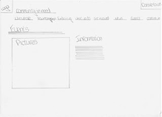
I have drawn up some drafts for my website and we based are website around these drafts.
file:///Users/40161/Desktop/web1.jpg

Monday, 21 December 2009

Story Board For our Website Video

This is my preliminary story board for the video for our site. There are six frames which illustrate what will be in are video. All of the frames reflect what are charity aims are and what will be done to achieve them.

Survey


I have created a survey, by putting together a variety of different questions. These questions provide us with a variety of different information about the audience.

Survey Results


Wednesday, 21 October 2009